
Music…the Fuel Behind Our Creativity
- GD Team
- News

Sure, we may talk to you on the phone all the time, and we send emails galore. But just how well do you know the team that you’re collaborating with? With this new blog series, we’ll give a little insight into our personal favorite things…design-related or otherwise. We hope you’ll learn a thing or two about us that you didn’t already know. Heck, let’s have coffee and continue the conversation!
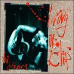
Album: Living in Clip
Musical Artist: Ani DiFranco
Why I Like It: Ani DiFranco was this outspoken female voice that, up until my introduction to her music in high school, I had never heard before. She was angry and outspoken and fearless and that was inspiring. Living in Clip is a collection of most of her music (at least the songs I liked) up until that point, and it was all live, and some songs with an orchestra for my high school self, it was so pretty and raw all at the same time that I fell in love it. The album artwork has actually always made me slightly uncomfortable — I hate that font — but I think that’s part of what makes it memorable for me. Sidenote: The first time I got this two-disk cd set in my hot little hands, I was grounded and a boy snuck over to my house on his bike while my parents were at work to drop off some music to help me pass the time during my confinement. Also in the pile were Bob Dylan’s Blonde on Blonde and Elvis Costello’s My Aim is True. Ah, memories.
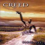
Album: Human Clay
Musical Artist: Creed
Art Direction: Daniel Tremonti
Why I Like It: This is actually an instance of how album artwork convinced me to actually never listen to the whole album. In the early 2000’s I was in college and my musical taste swayed from alternative rock to grunge to adult alternative to Celine Dion to hot dance hits, so it’s not really a big surprise that I was willing to take a listen to Creed’s Human Clay — With Arms Wide Open was a big hit! A thing I like to do is to open up the liner notes and listen to an album end to end while reading the lyrics. Once I opened the liner notes for this cd, I was confronted with so many awful photos of Scott Stapp that I never even bothered listening to the album. I know that musicians can be full of themselves… but there was just no way the music could win me over after having to bear witness to the shrine to Scott Stapp that this album’s liner notes had become.
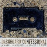
Album: A Mark, a Mission, a Brand, a Scar
Musical Artist: Dashboard Confessional
Photography: R.J. Shaughnessy
Why I Like It: Emo. The death of the cassette tape. So many feels. Even just looking at the album makes you sad.
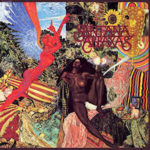
Album: Abraxas
Musical Artist: Santana
Cover Art: Mati Klarwein
Why I Like It: This just reminds me of my dad, not because it is colorful and chaotic and pieced together – but because my dad was a big Santana fan and his personality was none of those things. My dad is an engineer. None of it fit for me, I wasn’t even especially fond of guitar music, but my dad dug it, and that was all very fascinating to me. And the artwork was this collage-style, which was a hobby I very much enjoyed and led me on the path to graphic design, but I couldn’t relate to this one. So many disconnects with this one.

Album: Heart
Artist: Heart
Why I Like It: What is there not to like?! It is so, SO eighties and the hair and the outfits! And those Wilson sisters were ROCK STARS. They were cool, they were powerful, they were sexy, and they were women who fronted an awesome band. My six-year-old self couldn’t fully process all of these things, but I knew I liked them. I memorized every song and still know all (Okay, most) of the songs today. But I remember loving this cover a child – the reds and blues and the blacks. It’s not as if it is particularly well-balanced, his white shirt throws it all off a bit for me, but I still thought it was pretty classy.
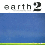
Album: Earth 2 (Special Low Frequency Version)
Musical Artist: Earth
Design: Jane Higgins
Photography: Art S. Aubrey
Why I Like It: Aside from being one of my all-time favorite albums from one of my all-time favorite bands, sweet baby Bodoni do I love that “2”. Heck, all of the typography. I won’t claim it’s ground-breaking type work, but I sure do enjoy it. On top of that (well, technically below it), it has such an impressively minimalist image that is just plain nice colors (see what I did there?). It’s earth, it’s enormous, the lifeforms are teeny-tiny, and I think it necessitates a double take. Yay sneaky existential questions woven into design!

Album: La Di Da Di
Music Artist: Battles
Art Direction: Dave Konopka
Photography: Lesley Unruh
Why I Like It: Battles is a weird band. Everything they do feels a little bit like a challenge to me, and though I may not love all their songs, I do appreciate the unique way they construct things. Which is what this album cover is. Weird, maybe uncomfortable, and constructed in a way that makes perfect sense while being completely bewildering. And while I enjoy the bizarre food composition, the color form “chart” below it (for lack of better term), is what really makes the cover for me. I have so many questions about the why of it all, but for some reason seeing the bizarreness reduced to a symbolic key somehow clarifies the intent.
As a side note, there is a neon green bar at the bottom that mirrors the flood neon green print inside the album jacket, which is just flashy as all get-out.
As another side note, the covers for the singles from this album (The Yabba, FF Bada) are in the same style and are equally wonderful.
Album: The Flower
Musical Artist: Trembling Love
Cover Art: Nick Filth
Why I Like It: As a musician, I would be remiss I didn’t include a local artist (and engage in some shameless semi-self-promotion). There are many great local album covers around the seacoast, but this one just blows me away. I may be biased, as Nick is a friend and co-founder of our tiny label, but I think this digital painting is bonkers. The album is an unquestionable feat of commitment (one 52-minute track), and the cover he made for it does it no disservice.
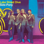
Album: Side Pony
Musical Artist: Lake Street Dive
Art Direction, Design: Jeri Heiden, Nick Steinhardt, SMOG Design, Inc.
Photography: Danny Clinch
Why I Like It: I know we don’t have to love the music from the album we share but… I love Lake Street Dive. They have an incredible and funky sound that always puts me in a good mood. They’re especially great live! The Side Pony album colors adequately represent the way that I feel when I listen to their music. I love the combination of purples, blues, and yellows. I also love that the ombre filter continues with the clothing of the band members.
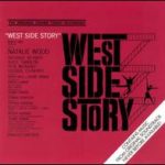
Album: 1961 Film Soundtrack
Musical Artist: The Cast of West Side Story
Design: Saul Bass
Why I Like It: Even though Natalie Wood needed Marni Nixon to sing all of her music on this soundtrack…it’s still a film classic. It’s also such a beautiful piece of art. I love the way the black on red is a kind of foreshadowing to the violence at the end of the film (spoilers) and how the fire escapes play around the typography of the film title. When I look at the two dancing silhouettes on the cover, I can hear Leonard Bernstein’s overture.
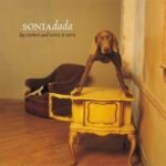
Album: Lay Down and Love It (Live)
Musical Artist: Sonia Dada
Design: Kerosene Halo
Photography: William Wegman
Why I Like It: The music on this album is what my dad would call “something to boogey to.” The dog on the cover is struggling to stay up on this table. This dog has very little to do with any of the musical content, but it’s very charming. If you look closely, you’ll also see the tail of another animal in the chair behind the dog. Is it a ferret? A cat? Another dog? The world may never know…
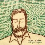
Album: Such Great Heights Single
Musical Artist: Iron & Wine
Why I Like It: My husband recorded a version of this song and gave it to me as a wedding gift. I always thought the cover art sort of looked like him a bit. So, I do love it for sentimental reasons, but I also just appreciate the texture and simplicity of the art itself.
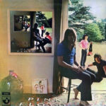
Album: Ummagumma
Musical Artist: Pink Floyd
Design & Photography: Hipgnosis
Why I Like It: I love it when math pops-up unexpectedly in design. This cover has a not-so-subtle recursive scene that goes on seemingly forever (a.k.a. the Droste effect). But if you look closely, the repeated scene isn’t quite the same….
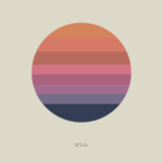
Album: Awake
Musical Artist: Tycho
Design & Art: ISO50
Why I Like It: the same reason as above…I love finding math in art. Only in this case it’s executed very differently. I love the color scheme and the simplicity of the geometry.
Oh, and I love pretty much any album cover in Project Thirty Three: http://www.projectthirtythree.com/