
Now for Something Completely Different…
- DIY
- GD Team
- Holiday DIY
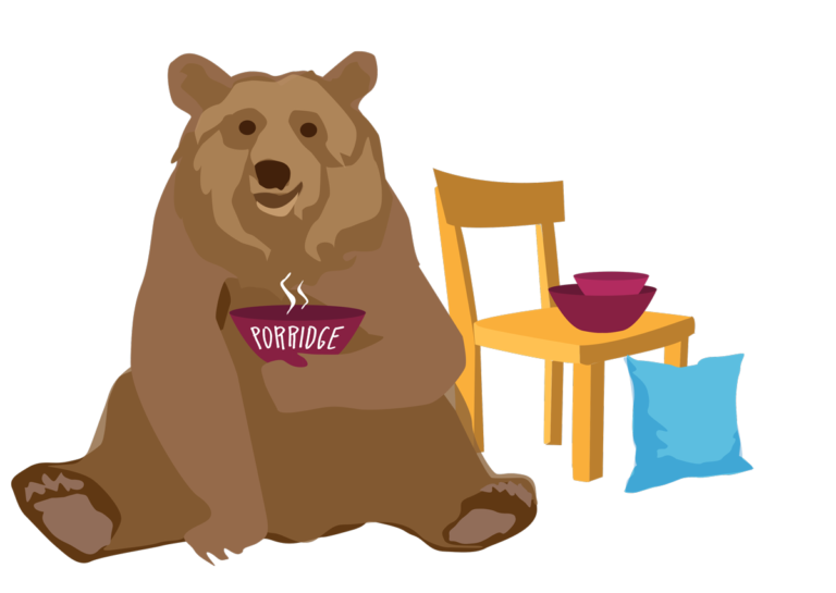
The following is a dramatization of the creation of an athletic brand performed by a sleuth of graphic designers. No bears were harmed in the making of this identity…
Creating an effective athletic brand is not necessarily a simple task. However, it is an important one that is often overlooked. Memorable athletic brands foster fan support, reinvigorate school pride, and boost planned giving. As such, your school’s athletic program deserves an identity that it can be proud of, not one that is disorganized or cookie-cutter.
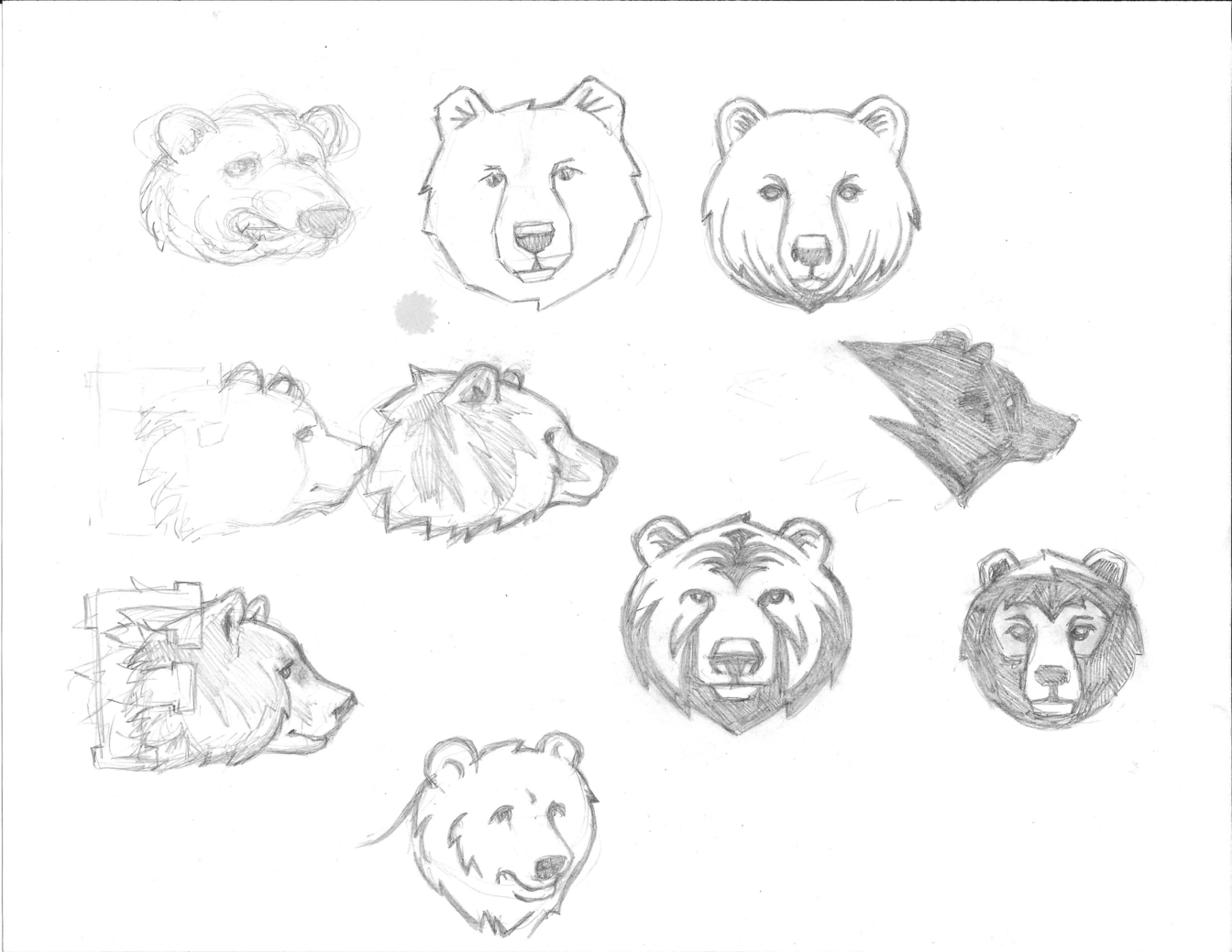
After completing The Fessenden School’s rebrand, we turned our attention to their athletic brand identity. Working together with their marketing, athletics, and facilities departments, we discovered the athletic brand was diluted with random graphics and fonts. There was no consistency in uniforms, merchandise, or even the graphics displayed on playing fields. When it came time to build the new identity based on their team name, The Bears, we took “The Goldilocks Approach” to design. For Fessenden, this meant creating a bear that wasn’t too scary or too friendly. During our sketch phase, we brainstormed different styles until we found a bear that would yield those “just right” results.
 Developing a new brand identity calls for following a sequence of steps, each with a clear objective toward an end goal. For Fessenden, the goals of the resulting identity were:
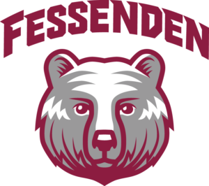
We took special care to create graphics that would work on print or digital media, and also translate well on apparel. We designed the main bear logo lock-up, but also secondary elements — a bear paw and signature “F” — to add a little flexibility into the arsenal of graphic assets to choose from. Oh, and we even whipped up a custom font for Fessenden to accompany the bear. As a result, Fessenden got an identity that looks great on athletic uniforms and merchandise, and perhaps more importantly, a bear they can call their own!
 After creating a strong athletic brand for Fessenden, we wanted the school to have easy access to their new files. To make sure the brand stayed consistent — whether displayed on a uniform, in merchandise, or in collateral — we created an online guideline that includes downloadable files to every graphic asset, as well as information about brand colors, and links to typography downloads. Consequently, staff members can easily create work based on the identity we constructed, or pass it along to their vendors, ensuring consistency of brand execution.